 |
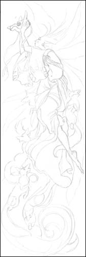 |
Step 1 - The sketch and laying the groundwork
As mentioned before, I use Strathmore lightweight illustration board for painting on. You can buy this by the sheet (22x30 inch size) in the paper department of art stores though it's not cheap, about $6.50 per sheet. I actually buy mine from http://www.misterart.com in packages of 25 sheets, at which point the price is about $4.50 per sheet.
If you've never painted watercolors before, I would actually suggest that you just go to the store and try out several different types of paper. You might find that what suits you the most is something entirely different. I tried out about 8 different papers before finding this was MY paper.
The Advantages? Acid free to the core (many other illustration boards are not). It is very smooth, but absorbancy is perfect. Allows for multitude of layering without ruining the surface. It's thick enough not to warp.
Anyway, back to the painting at hand. After cutting the illustration board to the correct size for my painting (12x5 inches) I begin by taping down the borders with some acid free artist tape to a masonite board. This just allows for easy handling of the painting and not having to worry about banged up corners. Also if you use thinner paper, this will prevent warping.
After that, I sketch directly onto the board with pencil, lightly. I only put enough detail to guide me, but elements of the background I leave to emerge as I paint.
|
 |
Step 2 - Starting to paint
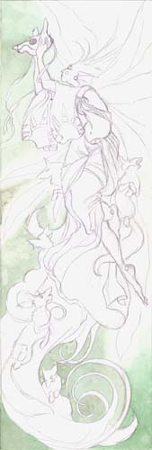
Now that the sketch is done, it's time to start painting.
I use the large Chinese brush initially to lay in the washes.
With mixtures of sap green, yellow green, and viridian green, a paint in a very light wash. Because I want the wings of the spirit to eventually have a glow to them, I fade in the color around the edges of the wings, to leave that area white. To get that fade in, I have to dab at it a lot as I go with paper towels. Also, reserving the whites of all the forground elements.
One of the things you have to be aware about with watercolors are where your lighter areas will be. Because the colors are transparent, you work your way down into the shadows, while keeping the lighter areas white from the paper. You end up painting in a lot of the negative spaces. It's a mindset that is initially odd and difficult to wrap your brain around if you work more with opaque mediums, but eventually it makes more sense as you work with watercolors.
Because of this, I tend to work from the background up to the foreground.
In the bottom corners, because I want more weight at the lower part of the painting, I use slightly more pigment so that the greens are darker down there.
|
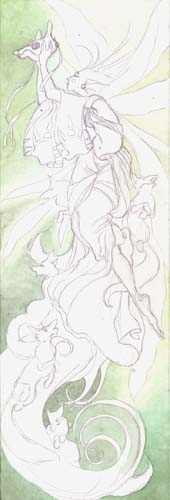 |
Step 3 - Building up the background
I add some more layers of greens in the background. The best way to have gradiants of color is to slowly build it up with thin washes. You have better control over it that way. If you are after a more textured look, then more pigment and a wet-in-wet approach might be more suitable.
I use more sap green in the upper left corner and lower right. I also mix in a hint of light red to the viridian green to start pushing in some shadows around the tail at the bottom and in the corners. With a mixture of lemon yellow and naples yellow, I fill in the white glow around the spirit's wings and to the upper right corner.
Between each layer wash that I put in, I wait for the previous layer to dry! This is important or else the colors just lift and you don't get the intensifying of added layers. It is especially imporant to wait for layers to dry when starting to work on adjacent areas. If you get too impatient, the colors will all bleed together, and you are left with no definition. While that might be desireable for some styles or for a specific effect, in this painting, it's not what I'm after.
|
<-- Previous Page Next Page-->

|


