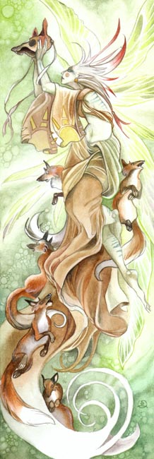
Watercolor Walkthrough for "Fox Spirits"

The following is a step by step walkthrough of how I painted "Fox Spirits."

I hesitate to call this a "tutorial" because it's not a description of techniques or definitive method precisely. It's more of a revealing of my personal process as I work on a painting. And in actuality, my method of working is usually much more haphazard than how you see it depicted in these pages. I've attempted to rein back to put some semblance of order to this, so that the entirety can be broken down into "steps."


Contents:
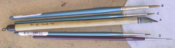
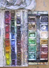
- Materials - Starting out
      - Brushes
      - Paints
      - Other
- The Process
      - Step 1 - The Sketch and laying the groundwork
      - Step 2 - Starting to paint
      - Step 3 - Building up the background
      - Step 4 - Developing the background
      - Step 5 - Underlayers for the foreground
      - Step 6 - The figure
      - Step 7 - The clothing
      - Step 8 - More clothing
      - Step 9 - Starting the foxes
      - Step 10 - Finishing the foxes
      - Step 11 - Finishing touches!


-Materials-


Brushes
  • (A) large Chinese brush. These are great for doing washes. They hold a lot of water and pigment, and because the purpose of these brushes are for calligraphy, they come to a very nice point. The one I use is approximately equivalent to a standard size 10 brush. Another bonus is that these are usually much cheaper than their western equivalents, and if you find a good one, it will last as long as their expensive counterparts.
  • (B) size 5 brush. Mid sized for laying in color but with a little more control.
  • (C) size 3 brush.
  • (D) size 1 brushes. For details.


Paints
I prefer pan watercolors versus tubes. Mostly for the ease of use and lack of cleanup. You don't waste any paint either because when you're done, you can just close up the case and reuse whatever has dried the next time. In fact, I find this preferable to using new colors at times because over time, various pigments mix and you can get some subtle and interesting shades that when used on a painting make the colors more lifelike. Be careful not to let the colors get too muddy however.
The brand I use is Winsor & Newton.

The following were the colors eventually used in this piece:
black
paynes grey
flesh
naples yellow
 
vandyke brown
light red
burnt umber
yellow ochre
 
sap green
yellow green
viridian green
lemon yellow
 
cadmium red
alizirin crimson


Other
  • pencils for initial sketching
  • Strathmore lightweight illustration board
  • masking tape for securing the painting
  • paper towels for wiping up extra moisture
  • water

Next Page-->